Altus

2025
Client Project
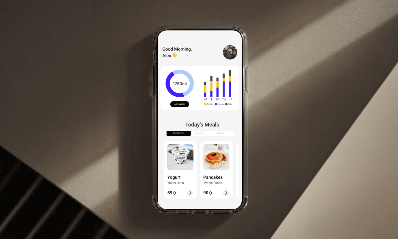
A challenging client project with a hard deadline — 7 days, a live product, and real users. The kind of brief that demands fast, confident decisions. Here's how I made them.
Product Designer | 2025 | Fitness & Nutrition App Redesign
The Problem
Altus had built genuine product value — integrated workout programs, detailed macro tracking, and progress analytics that competitors charged premium prices for. But users were leaving before they discovered any of it.
The issue wasn't the product. It was the design failing to communicate the product's worth. In a market where users make judgment calls within seconds, a cluttered, inconsistent interface was handing users to competitors with less functionality but better presentation.
The brief: Redesign 9 core screens, build a scalable design system, and deliver a complete developer handoff — in 7 days.

My Process
How I Approached It
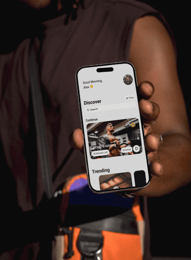
A sprint this tight lives or dies on prioritisation. Before touching a single screen, I ran a full audit of the existing app and a competitive analysis of MyFitnessPal, Nike Training Club, and Strava — not for inspiration, but to build an evidence base that would ground every decision made under time pressure.
The audit clearly identified the core issue: visual inconsistency was eroding trust, and the information architecture was burying the features that gave Altus its competitive edge. The competitive analysis showed exactly what premium looked like in this space and where Altus could differentiate rather than just imitate.
That clarity meant the design phase had no ambiguity — just execution.
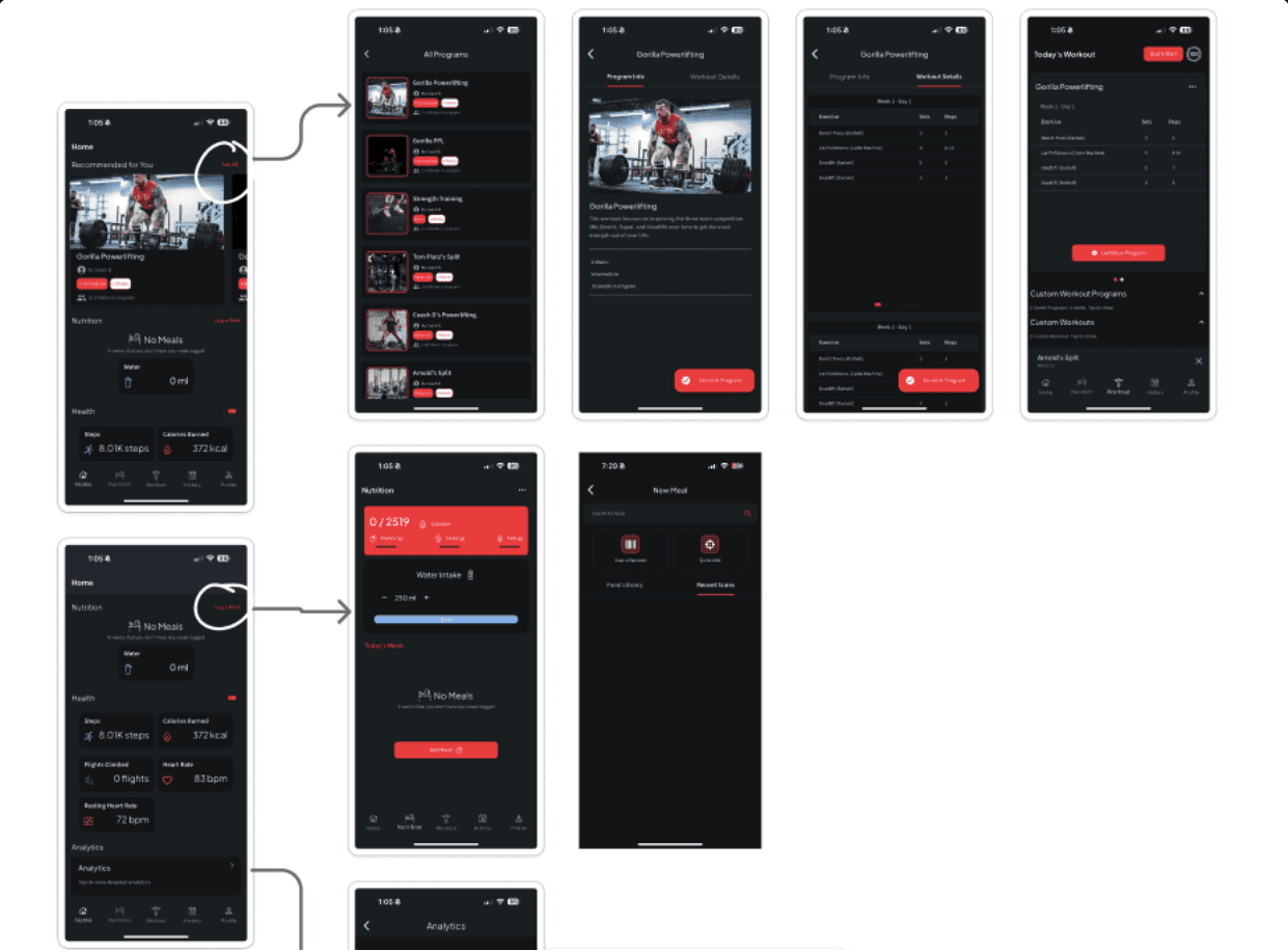
core flow before re-design
The Strategic Design Decision: Contextual Dual-Theme System
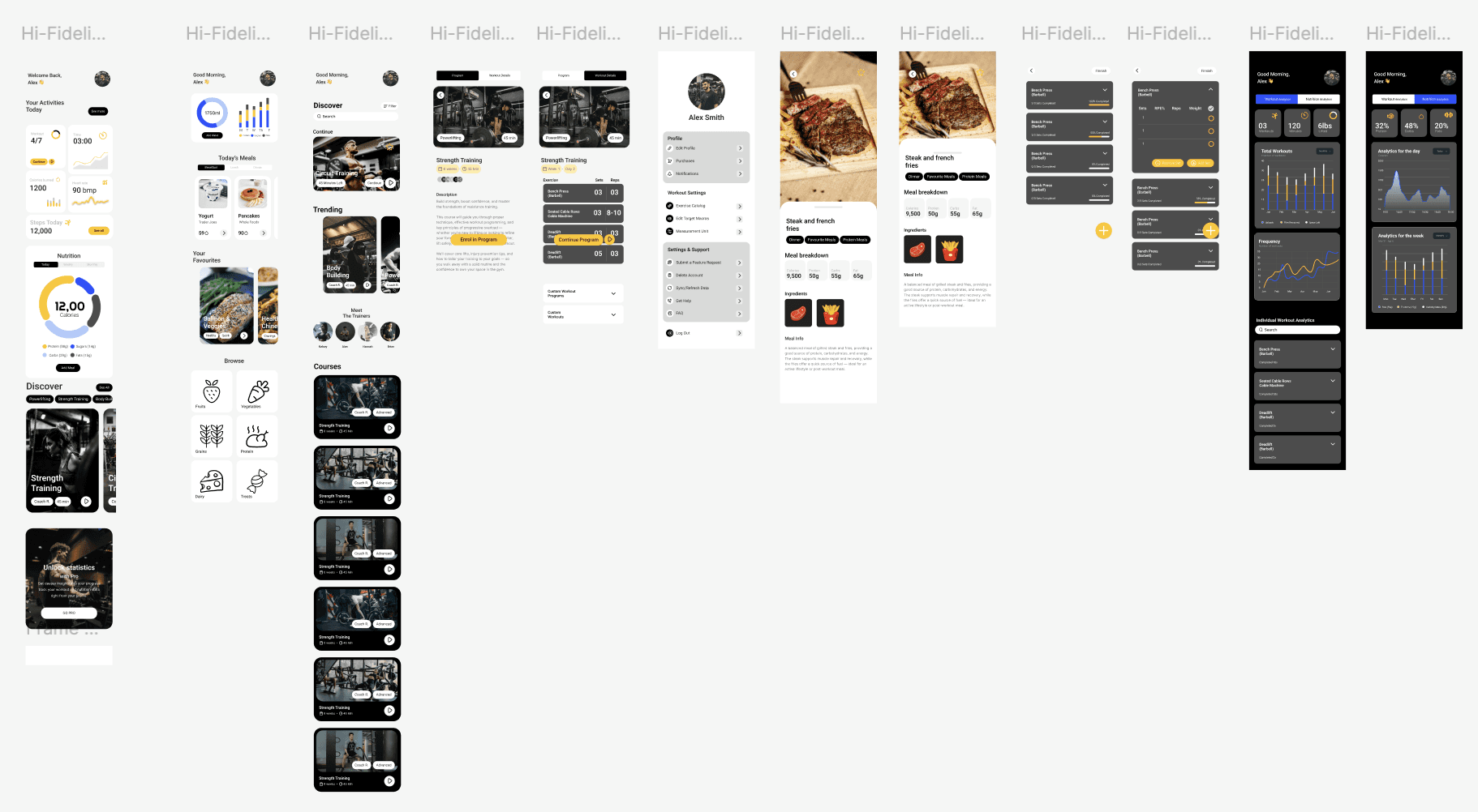
The most significant decision wasn't aesthetic — it was behavioural. Rather than a blanket light or dark theme, I designed theme as a contextual signal that tells users where they are in their journey without additional UI:
Light theme for active use — workouts, nutrition logging, discovery. Optimised for repeated daily input across varied lighting conditions.
Dark theme exclusively for analytics — a distinct mode that signals "you're reviewing progress" and focuses attention on data visualisation.
This reduces cognitive load by creating clear mental models. Users navigate by feel rather than having to read their way through the interface — which matters enormously for a product people use daily under varying levels of focus and energy.
Design System Decisions
Every decision was made with the developer handoff and long-term scalability in mind — not just the 9 screens in scope.
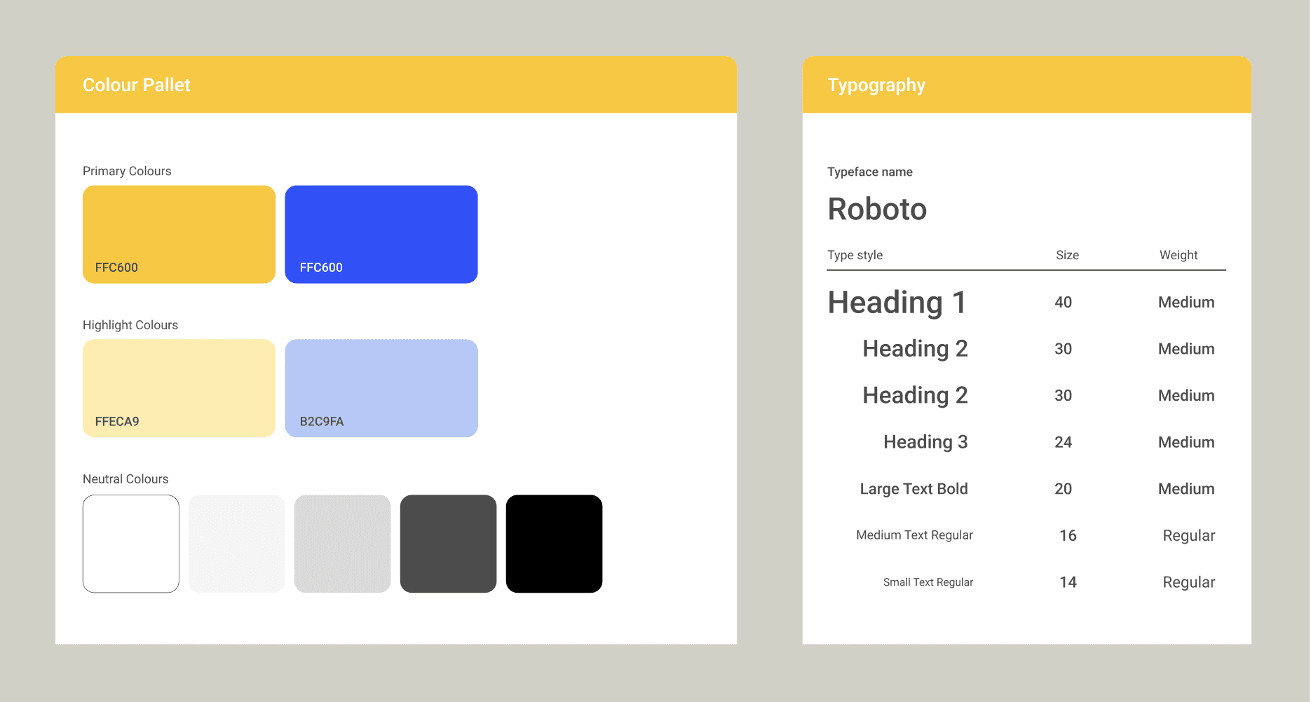
Yellow/blue accent system — high contrast, motivating, and functional across both themes. Built to scale across future screens without breaking visual consistency.
Hierarchy rebuilt around scannability — large, prominent numbers for key metrics, consistent card spacing, and typography that communicates without requiring the user to read.
Integrated analytics — connecting workout and nutrition data in a single toggle. Research supports that interconnected tracking drives better adherence than isolated metrics — and it became a genuine product differentiator.
Delivery: 7 Days in Practice
Days 1–2: Audit, UX pain point mapping, competitive analysis, strategy
Days 3–4: Full design system — component library, colour, typography, spacing standards
Days 5–6: All 9 screens redesigned, highest-traffic flows prioritised first
Day 7: Complete developer handoff — annotated specifications, component documentation, organised file architecture
Results
✅ Approved with minimal revisions — shipped to production on schedule
✅ Design system adopted beyond the brief — client actively extending it across new features, including custom programs and nutrition tracking
✅ Scalable foundation delivered — component library accelerating development on future builds
Post-launch performance metrics are being requested from the client. The clearest indicator of success: a client who shipped on time and came back to build on the foundation.
Key Takeaway
The best thing a designer can do under time pressure is remove ambiguity early. The audit and competitive analysis weren't preliminary steps — they were the strategic work that made fast, confident execution possible. Constraints don't limit good design. They demand better thinking upfront.


