MediScribe

2026
End-to-End Product Design
Product Designer | 1 Month (Jan 2026 - Present) | AI Clinical Documentation Tool
Problem: Physicians spend twice as much time on documentation as they do with patients — and it's costing lives. 371,000 deaths annually are linked to diagnostic errors, while patients leave appointments confused about their own care.
Challenge:How might we reduce clinician documentation burden while ensuring patients understand their care?


My Process
Research & Discovery
Through analysis of medical forums, two critical issues emerged: clinicians drowning in paperwork with little time for patient care, and patients leaving appointments unclear about medications, timing, and next steps.
The human cost of that second finding was reinforced early in the process. During a prototype review, a classmate shared this:
"It's really hard to be able to explain directly to physicians, especially now, about what symptoms you think you are incurring. I was so close to making that mistake last year and the doctors ended up finding a blood clot in my left shoulder. If I had just self-diagnosed I probably wouldn't be here in this class with you today."
Key insight: This isn't just an efficiency problem — it's a patient safety crisis.
Testing & Iteration
MVP Scope: One critical flow, validated for safety before expanding.
Patient consents to AI recording → Conversation transcribed in real-time → AI generates draft note → Clinician reviews and approves → Patient receives clear summary
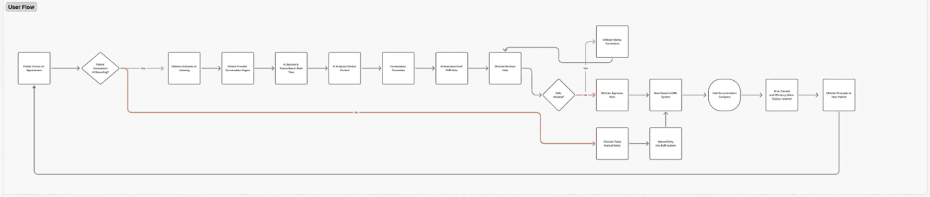
Round 1 Testing — friends and classmates, early validation
✅ Clean dashboard reduced cognitive load
✅ Colour-coded approval system signalled priority
❌ "Ambient scribing" terminology confused everyone
❌ Patient portal overwhelming for older users
Iteration: Replaced technical AI terms with plain language, emphasised clinician review in workflow, and improved accessibility across contrast, navigation, and touch targets.The
The Pivot: When Good Design Isn't Safe Design
Round 2 testing with the radiology clinician brought a critical gap into focus. The interface was clear and easy to use — but they came to a stop when asked to review a patient note. There simply wasn't enough patient information present to make a safe clinical decision.
"I need to see allergies, medical history, previous imaging. Without context, I can't safely confirm this is the right patient, let alone catch what matters."
The realisation: an AI assistant is only as safe as the data behind it. I wasn't building a tool that looks good — I was building one that keeps patients safe.
The Solution
Integrating comprehensive patient context directly into the review interface:
Full patient records within the review workflow
Visual hierarchy for critical safety info — allergies, medications, flags
Patient identification confirmation
Historical visit context for pattern recognition
Round 3 goal: Validate the comprehensive data that makes the system both clinically safe and useful in real care settings.
Impact & Results
Testing Outcomes
Metrics | Result |
|---|---|
9/10 | Users rated the interface as easy to navigate |
100% | Understood the approval workflow |
85% | Felt confident using the tool |
3.2× | Faster note review vs. manual documentation |
Note: Metrics reflect early-stage usability testing and are directional rather than clinically validated outcomes.
Key Takeaways
Safety trumps simplicity — a minimal interface that enables unsafe decisions is worse than no interface at all.
Clinical context is everything — the pivot from "this looks clean" to "this isn't safe yet" was the most valuable design lesson of the project.
Testing catches what assumptions miss — no amount of competitive analysis would have surfaced what one clinician revealed in a single session.